Dear Crème

project overview
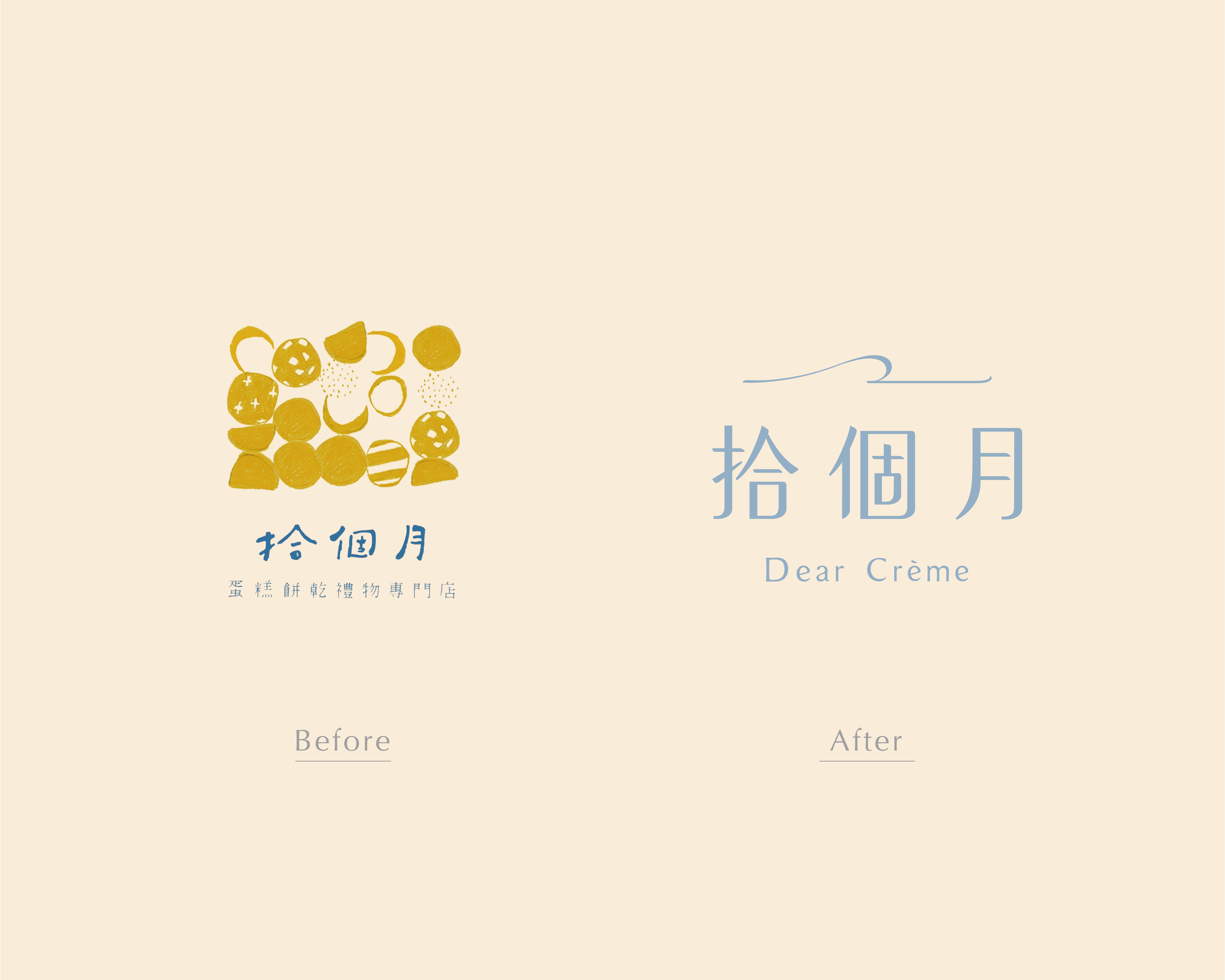
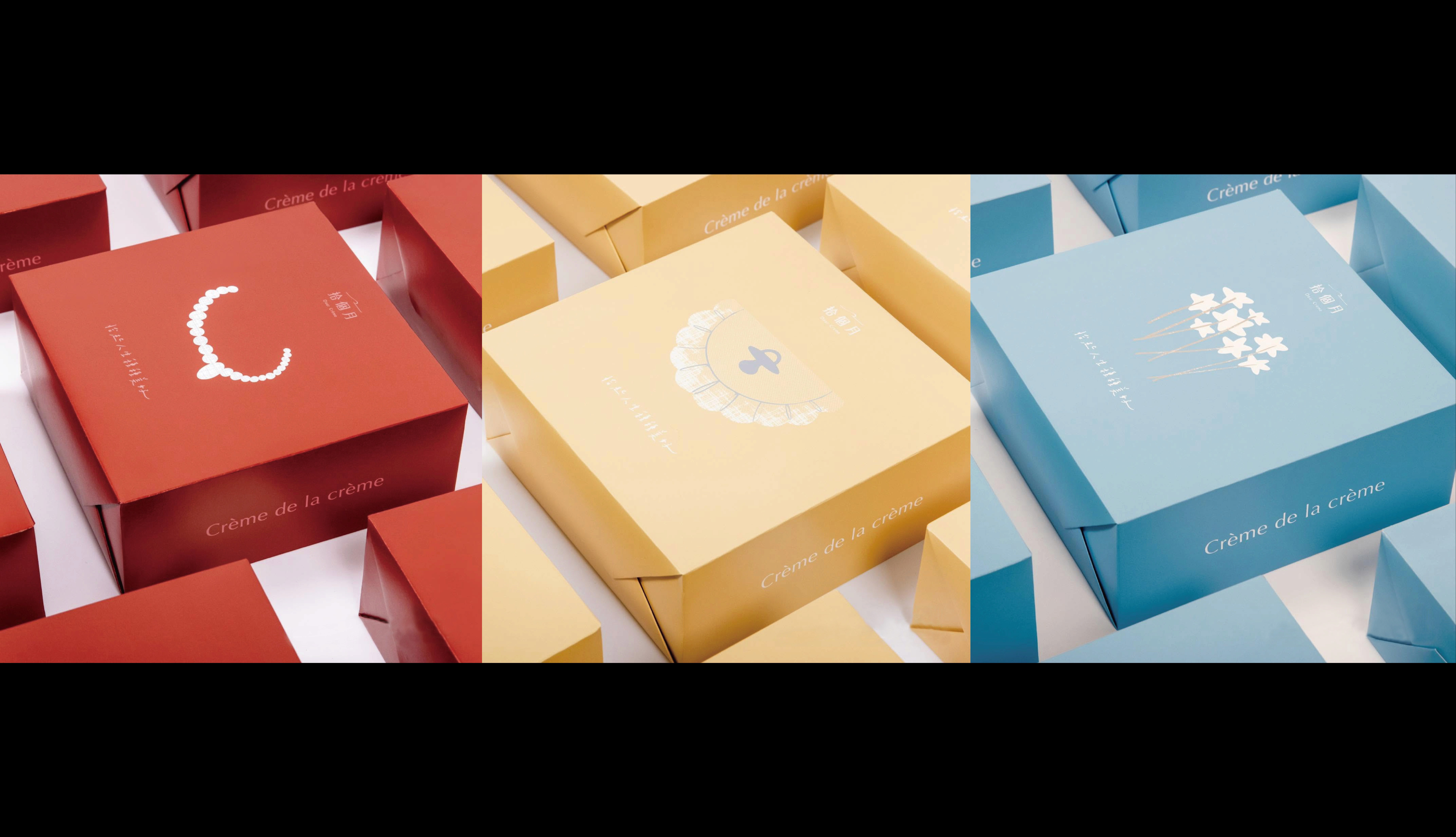
Dear Crème, "The most precious gift is the time we share together." As we revisited the essence of Dear Crème, we discovered that its warm illustrated stories had quietly accompanied customers for years. That inspired a simple thought: Stepping into Dear Crème should feel like stepping into a storybook. This idea became the foundation of the new identity, where turning the pages of a storybook became a metaphor for discovering stories and memories. Life unfolds through many chapters, such as school, marriage, parenthood, and everything in between. Along the way, we encounter new stories, dreams, journeys, and the people who matter most. It reminds us of Haruki Murakami's First Person Singular, where he quotes the French phrase: "Crème de la crème" — the very best of the best. The girl in the visual identity is gentle, curious, and brave. Like a close friend, she accompanies you through everyday moments, turning simple experiences into meaningful memories. Inspired by the bakery's light yet rich pastries, the visual identity reflects the same feeling through soft colors, clean typography, and an airy layout which create a sense of warmth, simplicity, and comfort. Throughout this project, we were reminded that feeling understood is one of the greatest gifts. It became one of the most meaningful experiences of our work as designers.
project type
Brand Identity
client
Dear Crème
info
Studio | Album Rivers Art Director | Yen Liu Brand Identity & Packaging Design | Ollie Kau Graphic Design | Yaya Chen