SiZZO

project overview
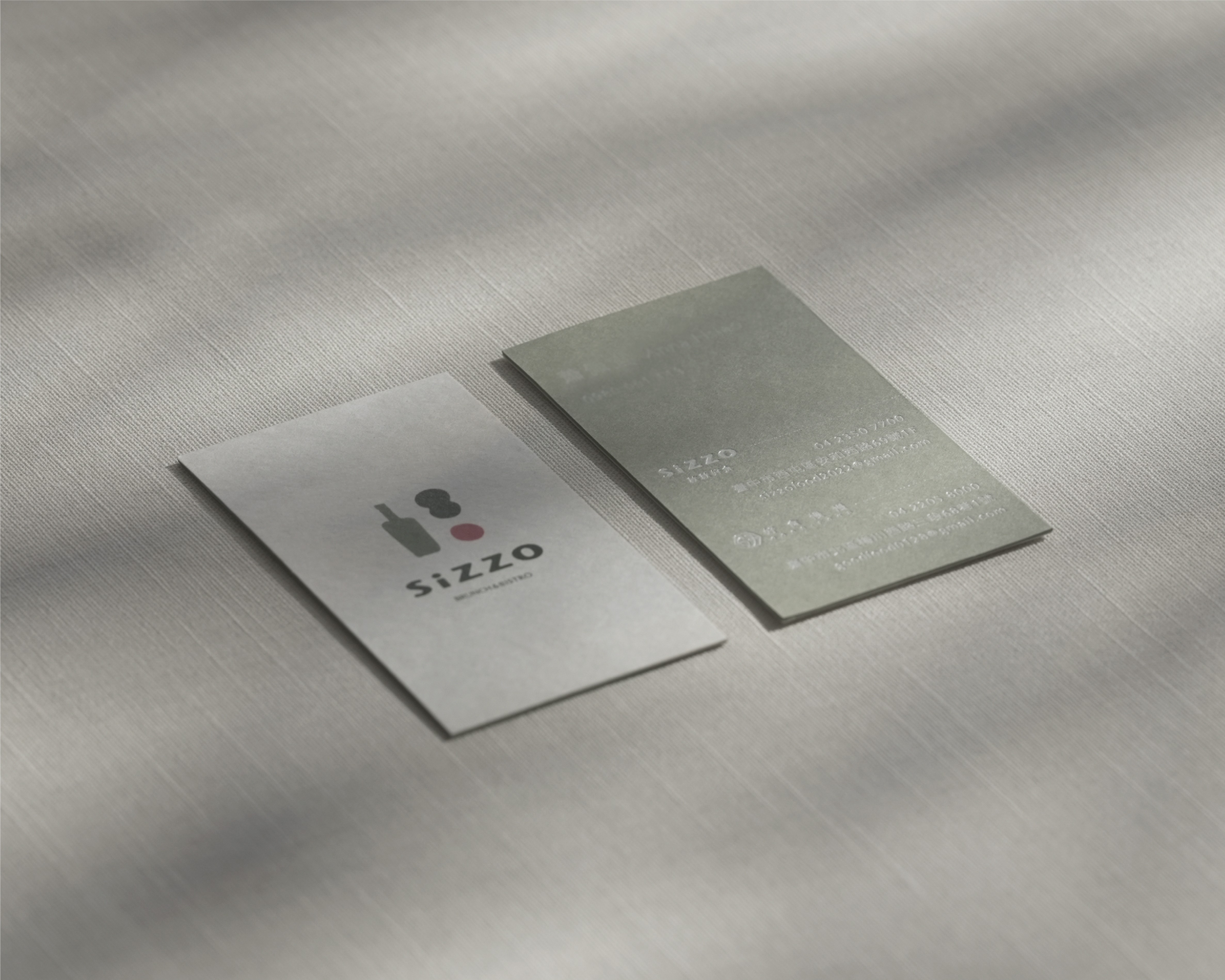
The meeting of the owners and employee partners, these two elements creates Sizzle which is a name that evokes the sound and warmth of food coming to life. It also carries the gentle Taiwanese expression, "Kuān-kuān-á chia̍h" ("Take your time and enjoy."), inviting every guest to relax, be themselves, and savor a peaceful afternoon. Whether it's the warmth of the sunlight or a quiet moment, SiZZO is always here when you need it. Inspired by this idea, the visual identity draws from the soul of Italian cuisine, olive oil and signature sauces. Organic sauce droplets symbolize the warmth of the chef's handmade creations and the rich flavors served on every plate. The typography is clean and minimalist, while its soft, rounded forms reflect the richness, warmth, and comforting spirit of the dining experience.
project type
Brand Identity & Packaging
client
SiZZO
info
Studio | Album Rivers Art Director | Yen Liu Brand Identity & Packaging | Ollie Kau Photography | Tea Chen