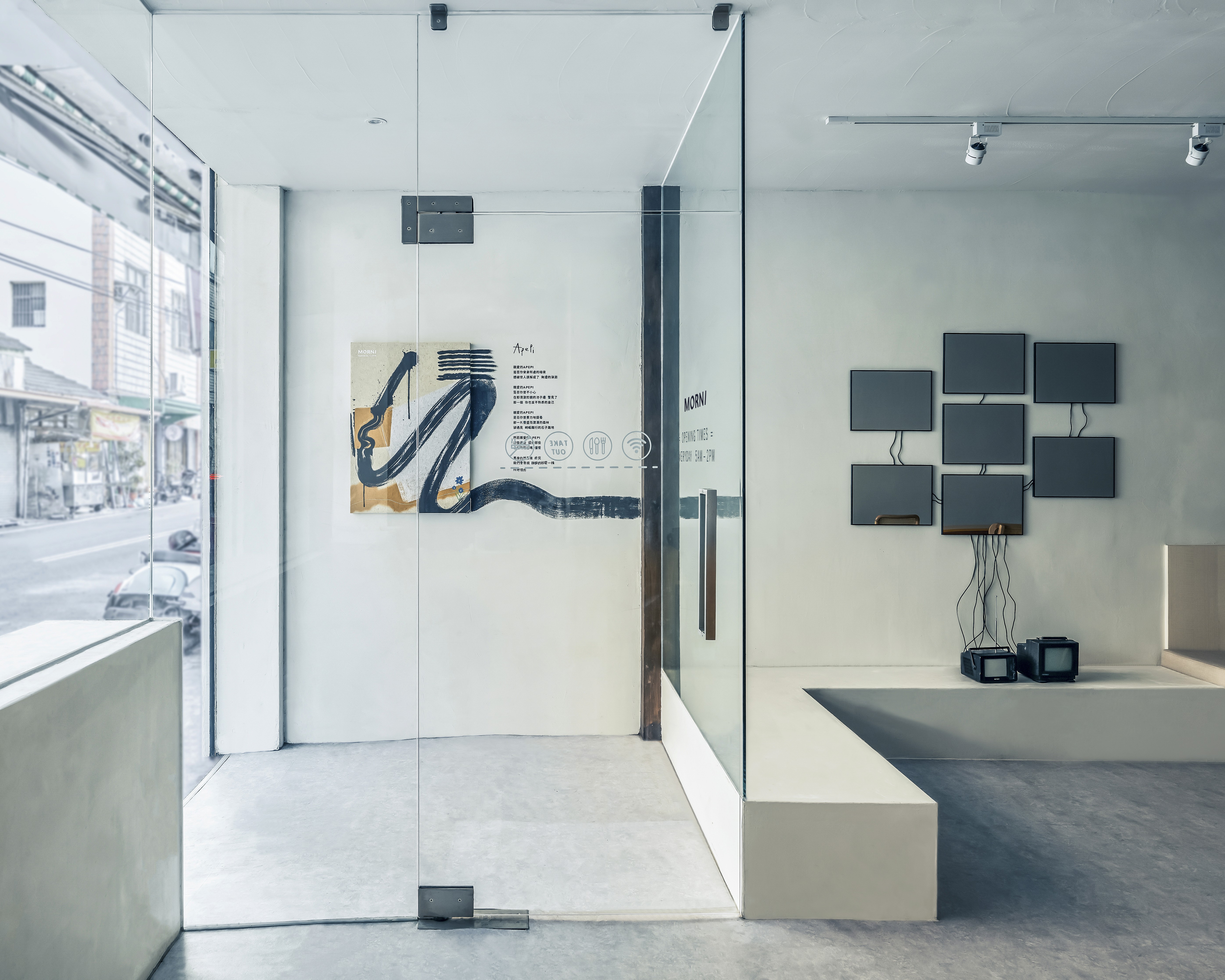
MORNI breakfast

project overview
"Out beyond ideas of right doing and wrong doing, there is a field and I will meet you there." - MORNI A playful breakfast brand designed around the idea of making everyday mornings more joyful. Inspired by simplicity and individuality, MORNI's visual identity is clean, modern, and timeless. Its minimalist typography features subtle organic curves, celebrating the beauty of imperfection and the warmth of being human. Each MORNI store is identified by its own geographic coordinates, representing the unique character of its neighborhood and the founder's vision of growing to 100 stores. More than a location, each set of coordinates tells a local story—one that we hope will continue beyond Taiwan and into communities around the world.
project type
Brand Identity
client
MORNI
info
Studio | Album Rivers Art Director | Yen Liu Brand Identity | Ollie Kau Photography | Tea Chen